Sunday 29 November 2009

Bristol Means Business

On a trip to Bristol I took some photos of the window displays on show. These ones are from Urban Outfitters. It's obvious that a lot of thought has gone into these windows - everything from the black and white lines that run along the front and then onto the back wall up to the shelves with the lamps on to the variety of wooden crates, panels, frames and tables that line the back wall and give height to the floor.

The style of lamps and tables combined with the iron mannequin stands and wooden crates establishes the feeling of a kind of vintage warehouse. I could see how this display wouldn't be everyone's cup of tea but I think some of the ideas used here are very clever. Maybe a few other paint colours could have been used on the various wooden panels to compliment the clothes and brighten up the window but apart from that it's looking good!


River Island had an interesting concept. They had sketched images from giant hands and animals playing instruments to mini people posing along the bottom of the window and hot air balloons and they all had a Victorianesque look about them. Some of the mannequins had animal heads on and one had a weird knitted balaclava on! I wasn't sure about this one. I think it would have been brilliant if the theme of the clothes collection was Victorian and the mannequins didn't have any plastic animal heads on. As it was, I wasn't quite sure what message the display was trying to convey, I have to say though, it makes you look and stare...and try to work out what it all means!

This is G-Star's window - simple and effective. I like the layered images and the repetition of the male image and male mannequin and female image and female mannequin.

These are Republic's windows. They had a clever idea of creating an autumnal look by making images of leaves out of their colourful autumn/winter collection. I just think they should have made the leaves bigger because people walking past wouldn't realise what the leaves were - I only realised when I got closer. If they were larger then potential customers could view the collection of clothes and be inspired to go in the shop.

This is the other window in Republic. I think it's effective as most windows are carefully put together and this makes you look as it's a mess! But it's fun and interesting as you try and work out what has been blown over. It has a rock and roll feel especially with the smashed TVs. The VM would have had a great time putting this window in!

I have been loving the Accessorize windows lately and this one is no exception. It catches your attention by being striking, fun and colourful and then keeps your attention as you explore the detail of the products, images and props.

The merchandise takes centre stage in this Monsoon window while the ornate but subtle gold and bejewelled hanging decorations highlight the image of the model and create a lovely backdrop for the mannequins.

The rucksacks in this North Face window create an impact because they are used in a good sized quantity in a repetitive manner. If I could make one change, I would have had five rows of the rucksacks instead of three and would have placed a mannequin in between the rows with their back turned to the window and a rucksack/bag on their back.


Friday 11 September 2009

Topshop Triumphs

I took these pictures of Topshop in York. Each one shows a different theme or idea - all geared towards keeping the customers interest.

The Topman window below is my favourite - not particularly because of the way it's been executed but because the idea is brilliant. The storyboard idea could be taken in so many different directions. In this case they have images of deserts mixed with urban street scenes which I found a bit confusing as the idea of a storyboard is that it follows a story. The way the window is set out makes the eye skip back and forth from these two completely different settings with no explanation. Also the desert images are a bit random as they don't fit in with the clothes on display. However, I do love the sketchy look, the arrows and the clipboards along the bottom as they all add to the storyboard/film idea.

If I was going to use this storyboard idea for an individual store, I would do a storyboard where the customer could follow a story through their own town/city. It could also involve male and female mannequins and could possibly be a love story - it would make a great Valentine's window. I would go and take photos of local locations and have models in them wearing what the mannequins would be wearing in the window. This would connect the images and the mannequins to create more of a cohesive look which I think the Topshop window is possibly lacking.

I love the vibrantly coloured pansies with skulls in the middle which are plastered across the back of this wall. I like the grungy feel you get from them and also how there are blocks of them and then individual ones scattered above and beside them. It leads the eye nicely to the cubicles with shoes in.

This display is promoting the vintage area upstairs. It's located right near the main entrance and the colourful, patterned art deco look would gain customers interest straight away.

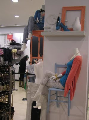
This is a well thought through display - I love how the peach and blue colours are linked through the clothes and props. Also, by hanging the chairs on the square column, the visual team have saved precious floor space.

Merchandise Display and Presentation Course

In July I completed a short course in Merchandise Display and Presentation at the London College of Communication. I had a fantastic time - I learnt a lot about Visual Merchandising and our tutor Sue Fraser was great.

For our first project, we had to go into the prop storage room and pick seven compatible items. I went for a country kitchen theme and chose rustic kitchen items with brown, light green and dark blue colours. I thought that this kind of display might look at home in the window of somewhere like Fortnum and Mason.

Our next project had the title of 'Colour Inspires...' After a brainstorm, I decided that colour inspires adventure and travel. The story of my display is that my mannequin was on the last day of her holiday and went to the beach while she waited for her transfer to the airport. However, time ran away with her and her realised she was running late so ran off the beach and dropped her suitcase in the hurry and everything spilled out. At the bottom right you can see that a crab that has crawled off the beach is hanging onto her clothes! Everything is brightly coloured and I tended to use items from the warmer side of the colour spectrum to create a sunny, tropical feel. I could imagine this display in the summer windows of a House of Fraser store.

This display had to be created around a mood and a style - I chose nostalgia. I wanted to use a brand in one of my displays so I chose a high end shoe brand called Strutt Couture. I decided to create part of a vintage themed ladies boudior and chose the soft, romantic colour theme to match the product (the high heeled shoes) and the mood and style. I used lace, roses, a fan, a black and white photo and pearls within the display to help bring about this nostalgic feeling.

Our final project involved creating a display where everything had to be suspended. I went with a theme which I called 'Midnight Mischief'. I had a group of magic blue and silver butterflies that were flying off with diamond encrusted jewellery and accessories in the middle of the night below a full moon. A silver butterfly net held by some invisible creature is trying to get the jewellery back. I could imagine this window being in something like Tiffany's or a high end department store that wants to show off it's new range of diamond encrusted accessories.


Monday 22 June 2009

Visual Merchandising Work Experience for Dwell Baby at Earl's Court London

In the summer of 2008 I did some more work experience in visual merchandising.  This time it  involved arranging Dwell Baby products for their stand in Earl's Court in London.  

When you stood in the space you felt like you were in a baby's room with the cot and the lit Dwell Baby sign as central focal points, shelves filled with toys and baby blankets and bags hanging off hooks.  The two sets of display cubes either side of the cot created interesting displays for customers to shop around and I think the colourful patterned products stood out against a plain white background. 


Saturday 20 June 2009

Visual Merchandising Work Experience in New Zealand at Kirkaldie and Stains

Whilst in New Zealand I did some work experience with the Visual Merchandising Department at the top department store in Wellington - Kirkaldie and Stains.  I assisted with the Mother's Day display.  White roses in the graphics and arranged in large silver pots around the store tied the displays together.  I painted plinths and flats, cut out graphics, laminated the pots and helped arrange the roses.  It was a valuable insight into the everyday life of a Visual Merchandiser.  Below are the photos of the final display:

I'd just like to say a massive thank you to the Visual Merchandising team at Kirkaldie and Stains for being so lovely to work with and for letting me help out!

Visual Merchandising in Russia...Again!

This definitely isn't the best window ever but I like the idea behind this.  Maybe it would have been better in this case if they had just kept to using different sizes of the inflatable rings and kept them more in the background so the product can be focused on more.

 I think I spoke too soon - the windows below are definitely the worst I've ever seen - the terrible ones in New Zealand and New York are great compared to these. What is going on?! You can barely see that clothes are being displayed, the little sale notices are completely different to each other and something has slumped to the bottom of the left hand window. They look so uncared for - I can't see how they would attract anyone into the store - awful!


Visual Merchandising in America

There was so much to take photos of in America - there was huge variety but it's clear that most of the shops here knew what they're doing when it came to visual merchandising. However, as in every country in the world, there was the odd one who had a very long way to go!  

I thought the rainbow effect created by this curving rail and different coloured tops was very effective.  The odd mannequin displaying the said tops emphasises the colourful collection.
    
This photo is of an in-store display in Macy's in New York.  The theme is 'Summer of Love' and the collective use of graphics, the peace sign props, a mannequin and plinths displaying accessories all (just about) tie in together through colours.  I like how the models peace necklaces in the photo tie in with the large peace props.

This display is in Macy's - I like the femininity it's portraying which matches the clothes.  The fragile looking lamp shade, the writing on the wall saying things like 'Your hearts desires' along with the black and white photos and white embellished photo frames all help achieve this look.  

This is the worst display I saw in America.  It was all way too much.  I don't even know where to start...! 

I thought this was so simple but really effective for the type of shop it was - a top end children's clothes store.  The white picket fence and tipped over bucket with white starfish hints at summer and completely goes with the cute clothes on display.  Store above take note - sometimes less is more!  

The next five photos are from a store called Forever 21. The first three are from the one in Los Angeles and the last two are from the one in New York.  The windows were good but I thought the in-store displays were great.  

The first photo is of the accessories area.  I loved the circular ornate tables, the candelabra, the black and white floor and the accessories displayed in glass bowls - the products weren't high end but these elements added a bit of class and created a lovely shopping atmosphere.   

 
I like the different positions of these mannequins especially the one in the pink dress as it's facing the door and it's in the brightest colour so could catch the eye of passers by.  I also like how the circular plinth reflects the circular light fitting above.

 I loved how these floral heads matched the floral tops below them.   

 
This display looks fun and very in season with the oversize flowers and insects mixed with the colourful wigs.  I like the simple use of the colourful hanging material on the second display - again looks perfect for the summer season.

 
The white walls and floor and clear perspex boxes create an airy and clean feel - a perfect base for the bold floral rugs and colourful clothes on the sunglasses wearing mannequins.   


I think this display is an effective way to create interest for customers going up the stairs to the upper level.  It's clear that the mixture of clothes and accessories have been well thought out as the pinks and reds work perfectly together. 

American Apparel's carefully placed rows of multiple mannequins effectively demonstrates their range of colours and product. 

I loved this in-store design in Abercrombie and Fitch in New York.  The mural and statue create a men's gym/macho feel - they definitely define the men's department! 

I wasn't sure about this display - I don't feel like the glittery umbrella or phone enhanced the clothes in anyway and I'm not sure what message I was meant to get from it.  

Saks department store definitely had a pink colour theme in their display!  Each window was painted completely the same pink as each other and then had slight variations of flamingos projected onto the wall.  Each window has a different designer and the mannequin dressed in their clothes was either all in pink or had pink somewhere in the outfit.

I love these plastic bubbles - there's a lot of potential with these and maybe this window could have used them even better.  Possibly a different background - one that looks more like the outdoors to create a more summery feel.

The following six photos are from a store in New York called Anthropologie.  I just loved the displays - it is clear that they have been very well thought through and that this effort had paid off.  They sell bohemian, vintage-inspired and well crafted clothes and homeware and this is reflected in the worn, soft colours and textures used and the quirkiness of their displays. 


This display was found on Melrose Avenue in Los Angeles.  I know it's not everyone's cup of tea but I think the coloured pipes that dominate this display suit the clothes that are being displayed down to a t.  They also create depth and give the mannequins access to different levels.


I liked this LA boutique because of it's quirky blue mannequins which stand out against the white walls.  I also like the words 'Courageous', 'Outrageous' and 'Contagious' written across the wall in varying letters and the silhouette portraits in the background.  This, plus the well spaced clothing racks, all adds up to a interesting and welcoming store. 


The falling white paper bells highlight the white textured dress at the forefront of this very effective J.Crew display.


I noticed two stores that used the same concept - transparent blue transfer to create a sea.  
These were Ralph Lauren Children (immediately below) and Juicy Couture (the following two photos).  

I think that Ralph Lauren was the more effective as you can clearly see a story - children fishing and a couple of them snorkling.  Also the fish look really effective, the variety of them add interest and they create a lovely background for the Ralph Lauren sign.  

The sea area and the area above are less defined in Juicy Couture.  Also, there is one mermaid and the other mannequins are normal but are standing on the sea bed and sitting in shells so it all looks a bit confusing. 

I liked this garden themed display - especially the wall of colourful seed packets.

Ralph Lauren has come up trumps again with these two summery displays - sailing rope, surf boards and sand all with well dressed mannequins displayed at differing levels.


Probably the craziest display I saw on my travels!  Not to everyone's taste but it definitely does its job and catches the passers-by eye!

This New York Lulu Guinness store was charming.  You can see another but very different example of a way to use a silhouette portrait - this looks more classic which is essentially the look of the whole shop.  I especially think the lip clutches displayed on the pretty white table really work as a focal point.