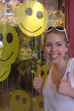
Here are a couple of windows that are fun but could be done a little better...
This Lakeland window doesn't sit right with me as my eye doesn't flow well over it. They're trying to promote their Cake Pops and I think the back drop image is strong but gets disrupted by the plinths and yellow house outline - a bit of rearrangement would help.
This Oasis window is great, I just think it needs a backdrop - maybe a landscape outlined in black.
These windows come from the Greyfriars Art Shop in Edinburgh. Their windows always interest me as they change regularly and have a handmade feel which sits well with the nature of the shop. I spend a while looking at them as they're always full but sometimes I think it's a bit too much. A bit of streamlining and repetition would help this.
Subscribe to:
Post Comments (Atom)


No comments:
Post a Comment