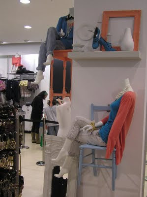
I took these pictures of Topshop in York. Each one shows a different theme or idea - all geared towards keeping the customers interest.
The Topman window below is my favourite - not particularly because of the way it's been executed but because the idea is brilliant. The storyboard idea could be taken in so many different directions. In this case they have images of deserts mixed with urban street scenes which I found a bit confusing as the idea of a storyboard is that it follows a story. The way the window is set out makes the eye skip back and forth from these two completely different settings with no explanation. Also the desert images are a bit random as they don't fit in with the clothes on display. However, I do love the sketchy look, the arrows and the clipboards along the bottom as they all add to the storyboard/film idea.
If I was going to use this storyboard idea for an individual store, I would do a storyboard where the customer could follow a story through their own town/city. It could also involve male and female mannequins and could possibly be a love story - it would make a great Valentine's window. I would go and take photos of local locations and have models in them wearing what the mannequins would be wearing in the window. This would connect the images and the mannequins to create more of a cohesive look which I think the Topshop window is possibly lacking.
 I love the vibrantly coloured pansies with skulls in the middle which are plastered across the back of this wall. I like the grungy feel you get from them and also how there are blocks of them and then individual ones scattered above and beside them. It leads the eye nicely to the cubicles with shoes in.
  This display is promoting the vintage area upstairs. It's located right near the main entrance and the colourful, patterned art deco look would gain customers interest straight away.


1 comment:
Hey!
I love visual merchandising. I was doing mannequins for American Apparel for awhile, and I found a bit of a passion. It helps if you have the right eye as well..and you do i love your displays...(that country theme (rusted...green pail...coffee beans..etc) was fabulous). Anyways I am a piano teacher and am in the midst of creating my own piano teaching method that I want to work into my own sort of piano studio-boutique and the ideas for store fronts here are absolutely fabulous. keep doing this blog and I will keep following!
peace
Post a Comment