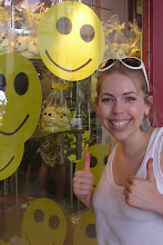
New Zealand's visual merchandising seemed to range from the fantastic through to the average and the terrible!
I thought this one was pretty average. The mannequins in this gentleman's boutique had boxes for heads with heads drawn on each side of the box. These three heads match the three lamps behind the mannequins. I think it's a very certain look but works for a gentleman's boutique.

The next two photos are taken of the Easter display in the Wellington department store Kirkaldie and Stains. I think they look really effective - the colours are fresh and the tree transfers link all the windows. I especially love the swing coming from the tree in the second photo with the child mannequin on.
I wasn't keen on this window display in Christchurch. The trees in both windows were obstructing the mannequins and the small and gold pine cones suspended in the air and strewn on the ground looked too Christmasy. Also, in the display directly below there is one necklace hung on one of the branches which looks very random. It was turning to autumn at this point so I can see that's what they were trying to convey in this display but as a whole it just didn't work. Maybe if the trees were behind the mannequins and they got rid of the gold cones it might be an improvement. It would even look good if they wanted to concentrate solely on selling the jewellery and in one window got rid of the mannequins, just had the tree and hung loads of necklaces and bracelets of it to look like they were growing from the tree.
The following two photos are from another boutique in Christchurch. Both windows are linked by a heart shaped patch of grass which I think works much better in the second picture as the shoes are displayed on it so it looks like it has a purpose and makes the overall display look simple but cute. In this first photo however, the grass heart is just sitting there on its own so it has no purpose. This alongside the two silver moons and the picture of a bird creates a random display without a cohesive look.

 I thought this display in Auckland was great with the youthful, colourful graphics taking centre stage - a sure hit with its teenage customers. The posters advertising local bands and the sweet machines placed to the left as you enter the store all add to this funky feel.
These two displays from the same shop in Te Anau have to be some of the worst displays I've ever seen. There is so much space, and yet everything is clumped together so you can hardly see what is being displayed. The tables in the first photo are awful as is the poster at a jaunty angle in the second window. There is no scheme to join the two windows - the only thing which is the same is the light green wall section at the back, which is not enough.
The first window is promoting mothers day so one assumes the products are gifts that you could buy for your mum but the mix of products don't go together in anyway, shape or form. If they were different types of products but had the same colour scheme or theme that would be great but there is nothing to bring these items together - it looks like a jumble sale.
The display tables in the second window are nice but there aren't enough with two and the space is too large to have such small amounts of small product in it.
This space has so much potential - what a waste!


2 comments:
Hi! I thought u might be able to help since you're into visual merchandising. A friend who works as a visual merchandising account mgr. for a company that designs and fabricates 3-D retail props, displays and fixtures at RetailDisplaysAndProps.com told me about an incredible book he read a couple years back about the industry, trends in visual merchandising, etc. written by Sheila Goddard from NY. I've Googled the author's name until i was blue in the face, but can't find anything about her or the book. Ever heard of it? Thank you in advance!!!
Hi Stephen, sorry it's taken a while to reply, I've been looking for the book since I read your message but unfortunately with no success! I'll keep looking though, I'm intrigued!
I do have a recommendation for a really good book about visual merchandising though. It's called 'Visual Merchandising: Window and In-Store Displays for Retail' by Tony Morgan. Hope this is useful!
Good luck with your search and I'll post a comment if I find Sheila's book!
Post a Comment