I found that on the whole Australia had quite sophisticated displays.
This Portmans store in Brisbane had an interesting display where cootie catchers (I think that's what they're called!) were plastered all over the back wall with gaps left to highlight the mannequins. I like how the cootie catchers follow through onto the floor to surround the feet of the mannequins. I think this window could have been improved slightly if maybe there was one more mannequin at a lower level bringing the group to five. It could lay in between the singular mannequin and the grouping of three as usually odd numbers look better than even. Also, this display could be used to demonstrate the hot colours of the season. If the mannequins were wearing splashes of these colours, they could be replicated in a few of the cootie catchers therefore reinforcing the look.
 I put this photo in of a shop in Surfer's Paradise just because I like what they had done with the sale sign - it fits in much more with the shop look than bog standard red sale signs.
I liked the display in this Melbourne shop selling nesting dolls. Even though it is crammed full, it's thoughtfully done and looks fun. The product is small so large quantities of it give it authority and enables the customer to see the variety of dolls the store sells. Also, the mixture of baskets and wooden boxes gives it interest.
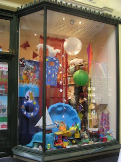
I think this childrens store on the other hand has too much crammed into the window. There's nothing to focus the eye on and it just looks confusing with the variety of products displayed in it. There is some-sort of vague outdoors theme going on but with lots of the products just randomly suspended and with a red curtain for a backdrop, the theme starts to disappear.
I thought the visual merchandising in the Melbourne store below was excellent. In-store and out had a cohesive look based on an achromatic colour theme with lots of mirror and glass chandeliers added for a touch of glamour. The windows had a retro, rock-chic vibe which matched the mannequins clothes. Records were strung up and piled on the floor alongside a microphone and speakers. A rotating floor section and white plinths add interest with movement and height variation.


The entrance of the store emphasises the retro glamour look with a wall of vintage black and white fashion photos, an intricate mirror and mirrored dressing table, long swathes of white material draped elegantly along the wall and the hint of a chandelier up the escalators.
 This classy hot shop displaying the must have clothes of the moment is surrounded on either side by accessories and make up that would compliment the outfits shown. This area was on the upper level on the shop where the more expensive clothes were stocked - giving the level a more exclusive air.
I liked this store because it was so bold with its visual merchandising. The multi-coloured bunting and crazy pile of purple, pink and red television sets mixed with flamingo statues and shiny red heart balloons alongside strings of coloured bulbs, pom poms and 2D stilt walkers with hula rings shouldn't work, but it does. It's perfect for the shops targeted age range - young teens and it makes it look like a fun place to shop. It also works because it has the image of the same model with matching pink hair in both displays and this brings the look together.
These last images from Australia are taken from the same shoe shop - one window is for women's shoes and the other for the men's range. Both are room settings with a tartan theme. I think this works because the tartan is a different pattern for both sides, matching the particular shoe collection and showing the difference in the collections while tying each other in with the same pattern. Also the different types of props have been well thought through - I especially like the red flowers on the woman's side giving the window a more feminine touch.


No comments:
Post a Comment