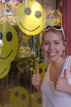
Firstly are photos from my old favourite Libertys. This year they went for a tacky theme with tinsel and plastic bows everywhere. The first thing that caught my eye was this massive tinsel covered robin surrounded by tiny birdhouses stuffed with beauty products.
 The rest of the Liberty windows differed from this first window as they depicted interiors and exteriors in normal scale but they still had the tacky theme. I think the windows had an 80's whiff about them (which makes sense as it's probably the tackiest decade!) and this adds a feeling of nostalgia that many of it's customers could relate to. For example, the windows below had me spying for items that bought back memories from my 80's childhood including Diana and Charles mugs in the royal memorabilia window and one of those large doll heads you can put make up on in the 'granny's living room on Christmas day' window!
I think this is an interesting and probably suitable theme for the times - with the recession having hit, this tacky but nostalgic theme is anything but showy.


This is what I love about Liberty's - their windows are so fun looking and artfully crammed full that you get drawn in and become totally absorbed in looking at all the details and in doing so, most importantly of course, you start to look at all the products on sale which are placed amongst the props!
The theme continued in store with thousands of plastic bows plastered across the ceilings (it must have taken the visual team days!) and mannequins with tinsel afro's.
The Christmas shop was fun looking and crammed to the rafters with product displayed in fun and creative ways including using wooden crates and large glass jars.


I went to many different Habitat stores and these photos below are a collection of all the stores I visited. The theme was City Lights and this was reflected in the windows with neon lights and bright colourful circles on the windows and fixtures which stood out against black backgrounds.


In store there were so many creative ways products were displayed. Below are just a few examples but my favourite is probably the Okko clock with the flowers in the upturned glass jar just below.


I think the garlands and fringing here look really effective - the pink and dark colour scheme works really well too.


I can't remember the name of this shop but I quickly took a photo because I thought the use of the giant collar to group the mannequins and the bowler hats framed on the back wall were really clever ideas and well used. A lot of attention is given to displaying women's fashion so it's nice to see men's fashion taking centre stage for a change.

These photos are of Heals - their windows were very bold and eye catching. They had an all gold display on a set of fixtures and then a sitting room/dining room section of the window with large present boxes on the shelves and over the top table dressings.


The Lom Bok store had a fairy tale theme with quotes from various fairy tales written around the store - for example there was 'Looking-glass, looking glass on the wall, who is the fairest of them all?' next to a display of mirrors.


I think the cubby holes that house the lights are clever because it focuses your attention on each lamp.

I liked the Christmas Paperchase window because of the strong use of colour produced with seasonal products and also the star strewn backdrop emphasised by the large neon stars.
 Next wasn't as impressive - squeezing Next Home and Next Children together in a window with completely different seasonal themes is just confusing and doesn't look cohesive. It would have been better just to have had Next Home fill that particular window.
However, I did like the silhouetted home images on the side wall! It defined the home ware section of the window nicely.


